HERE at CES
Location Intelligence explained
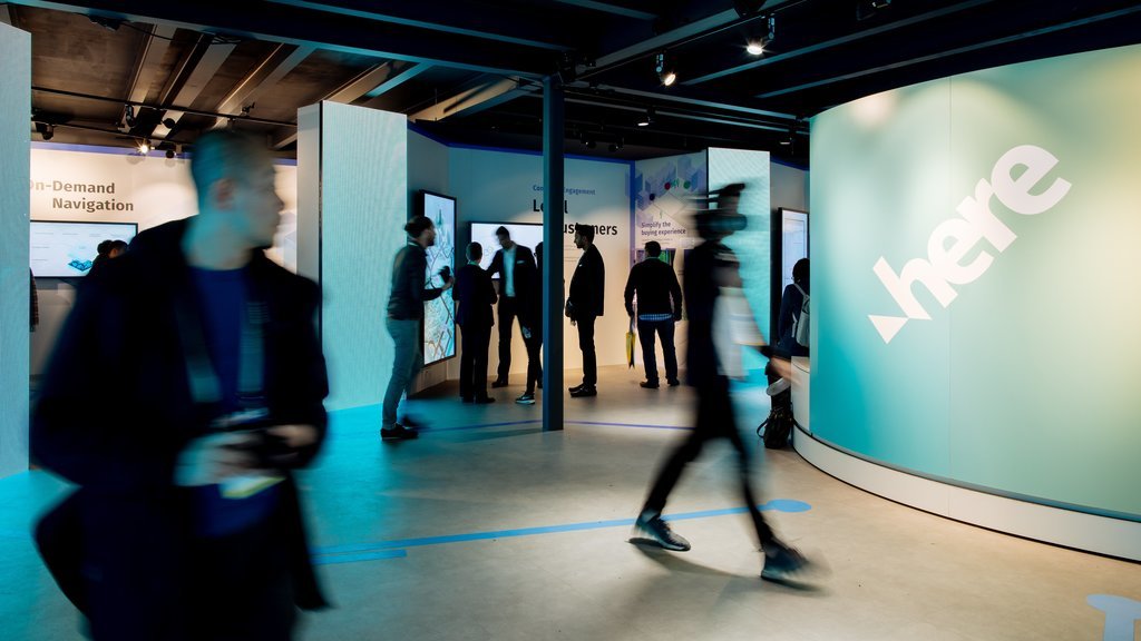
How do you design the perfect environment to showcase and explain products that are not “things” in the traditional sense? This is exactly the challenge we tackled with our client HERE Technologies, a location data and technology platform – innovative, complex and high-tech. Our task was not only to develop a platform for presenting these solutions at the world’s largest consumer electronics fair CES Las Vegas, but also make the brand itself tangible. Embracing the architectural concept by our partner Jack Morton, we turned the 400 m² pavilion into an impressive and well-structured hub, inviting visitors to discover a data-driven world.
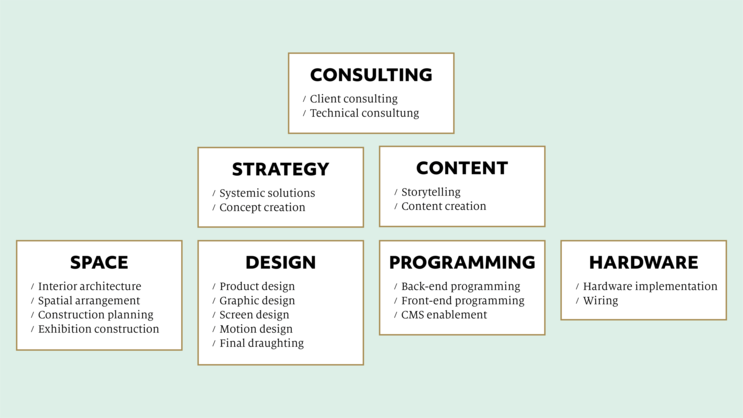
After the successful CES 2019 pavilion, our field of responsibility was expanded even further. This time, we were the main creative sparring partner in developing, designing, and realizing the whole communication environment – both analog and digital. From initial consulting and conceptual workshops to the final wiring, we provided a complete package with all competences united unter one roof.
The Concept
With a deep understanding of the brand, its values, products and people, we created an authentic narrative and thereby a consistent framework for all creative decisions. During the whole process, we worked closely with HERE's experts.
The Space
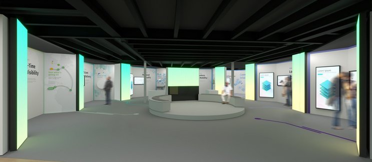
In close collaboration with Jack Morton, we translated the concept into an environment with clearly defined areas and a coherent design lending logic to the various topics addressed and holding the opportunity to highlight and structure.
The look
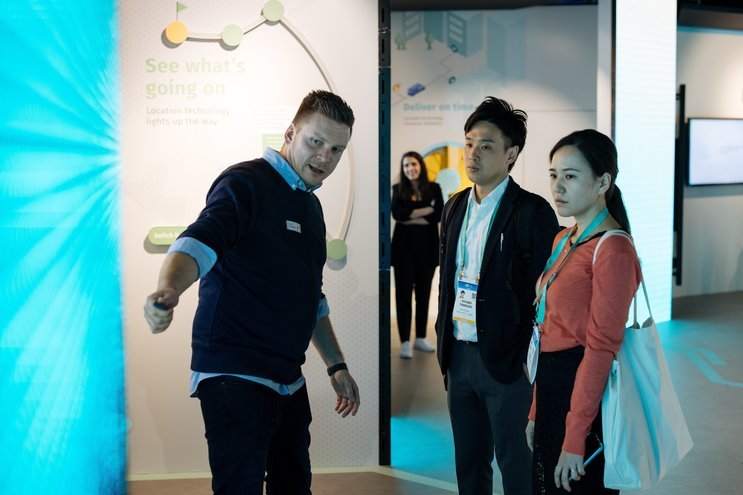
We formulated an aesthetic language applicable to all elements of the experience, from interior design to moving image. Together, they create a consistent, friendly atmosphere and help communicate brand messages at first glance.
The Story
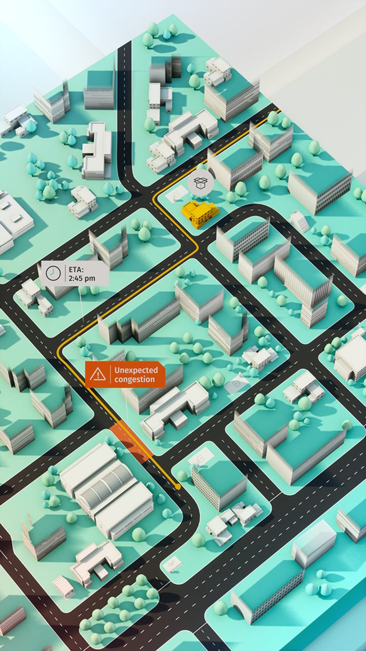
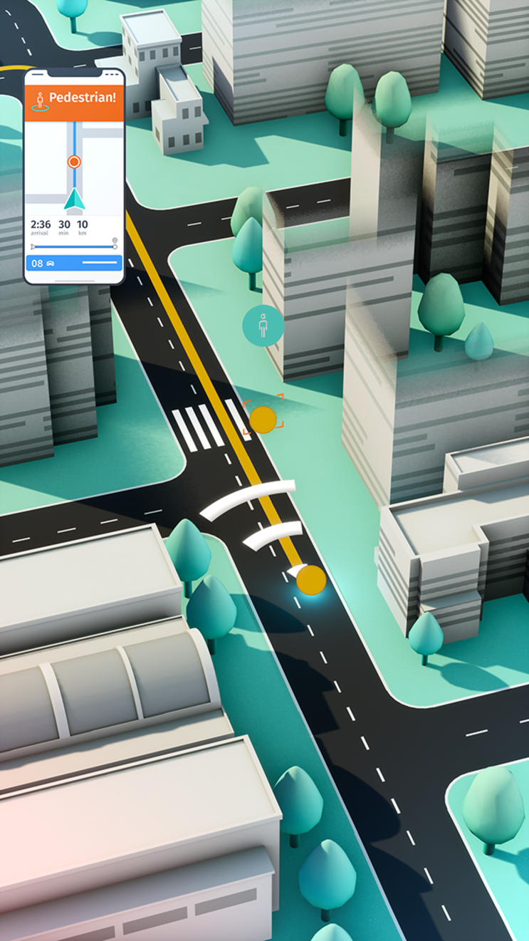
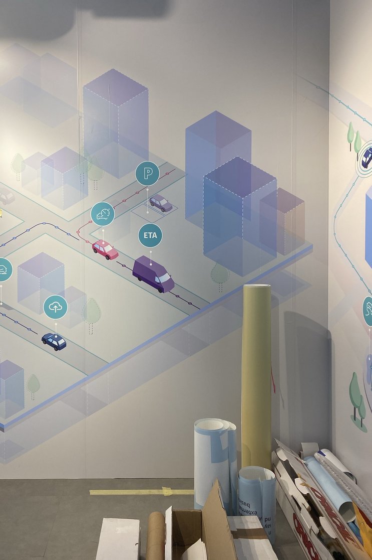
To explain the wide range of complex products to a diverse audience, we broke them down into relatable real-world scenarios. Illustrated in digital and analog media, they offer a low-barrier starting point for presentations and make the brand accessible to everyone.
The technology
Building on last year’s high standards, we took the technological basis to the next level. With a powerful content management system and enhanced graphics and functionalities, this update made the presentation tools for HERE’s brand ambassadors even more impressive.
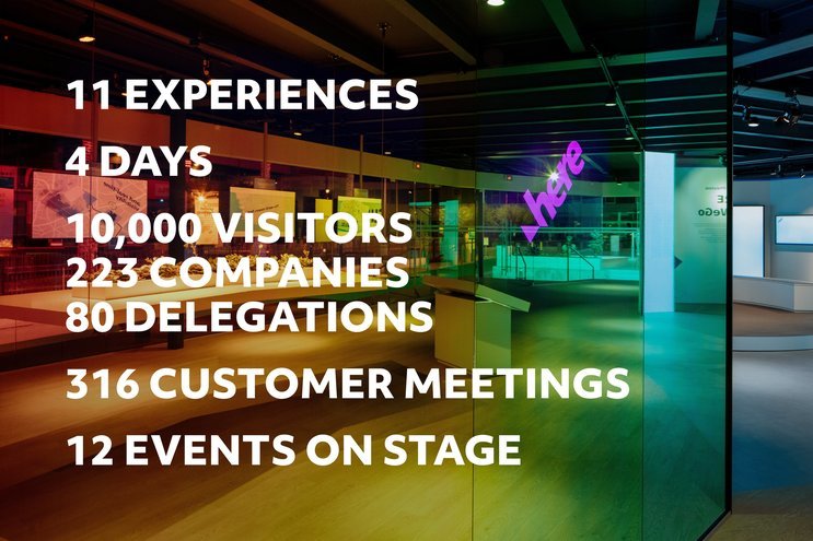
The result
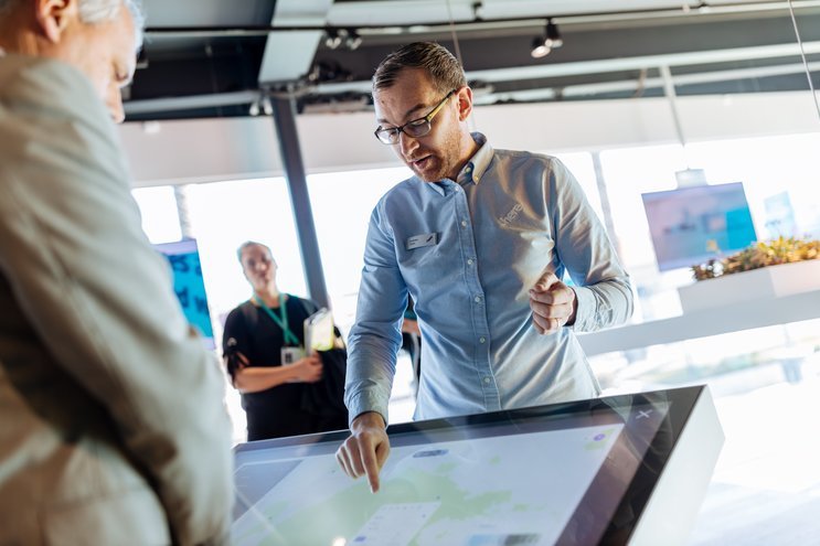
In combination, all these factors contributed to creating a convincing experience once again – for our client, the brand ambassadors on site and the visitors equally.
A Marketplace for Data
Products translated into space
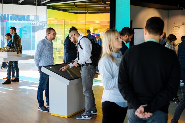
The goal was to create one consistent visitor journey with all elements logically derived from a holistic approach. In close collaboration with HERE, we developed a spatial concept providing a versatile framework with multiple levels of complexity, smoothly guiding visitors from eye-catching lighthouse effects down to playful expert-level infographics.
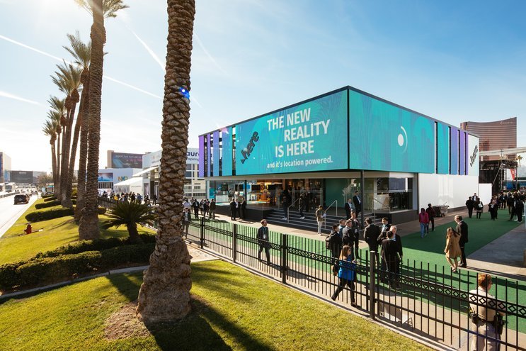
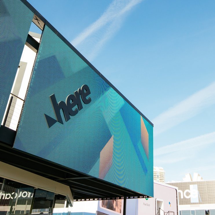
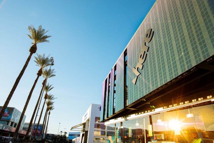
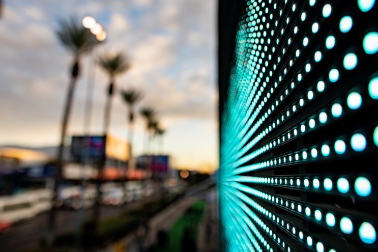
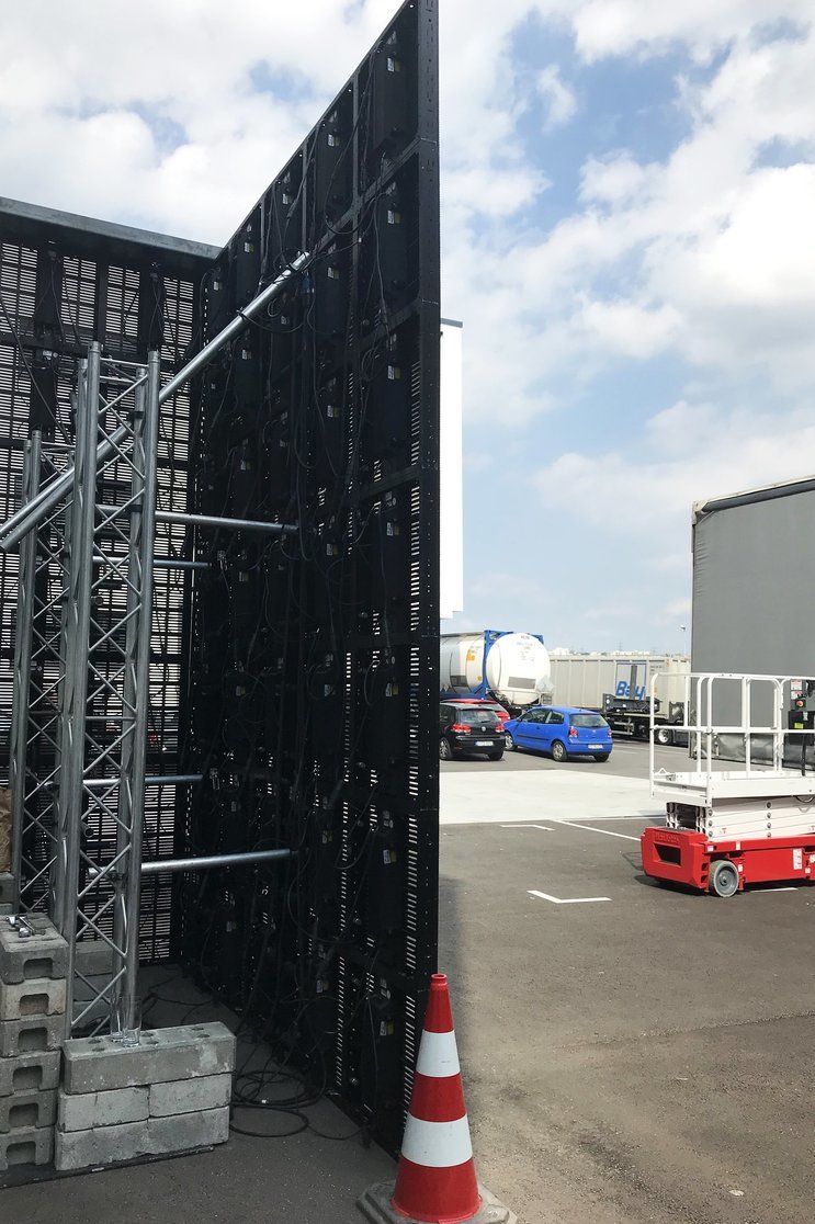
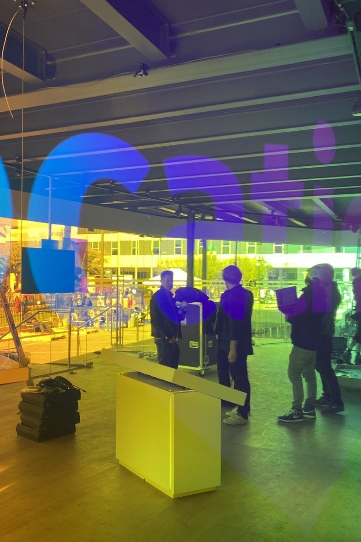
The mood for the brand experience is already set before visitors enter the pavilion: they are greeted by an LED-wall, communicating key messages combined with bold and colourful animations developed in cooperation with wecandance. Exterior and interior visually blend, with synchronized lightplay on the exhibition floor being visible through the transparent architecture. With their special, low-res LED aesthetic, a unqiue look is achieved.
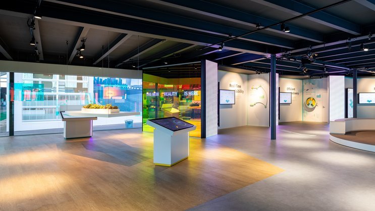
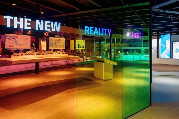
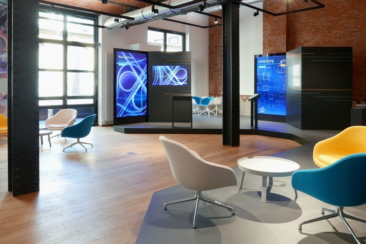
The interior of the pavilion is designed as a journey through the universe of HERE. Center stage was not given to the products, but the company behind them. The choice of colour, material, light, animation, analog and digital media create a friendly, open atmosphere in line with HERE’s brand values.
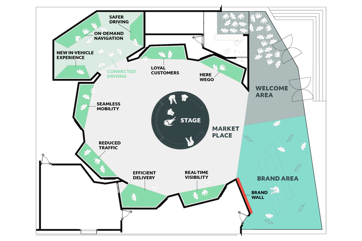
The exhibition space is devided into four areas which together form one coherent narrative.
The Welcome Area
The Brand Area
The Market Place
The Stage Area
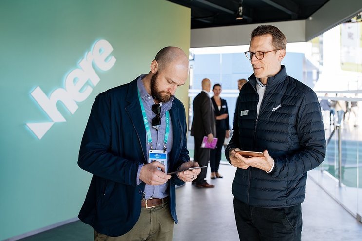
The welcome area is the first touchpoint with the brand. Visitors are greeted by HERE staff, introduced to the company’s field of work or guided to the correct contact person for meetings and presentations.
The brand area is where HERE is prominently presented as a strong, innovative and approachable company. The animated brand wall acts as an eyecatcher while suspended screens and satellites allow for deeper engagement with contents. For this area, we worked closely with Jack Morton and Bitteschön.tv.
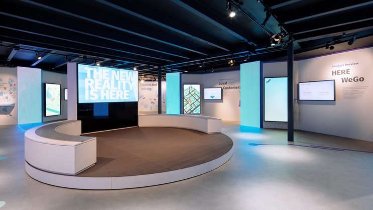
HERE works on establishing a global market place for location data. We translated this core idea into a spatial concept for the main area of the pavilion, ideally suited for structuring various thematic areas.
The nucleus is formed by a circular stage where experts give insights into the future of location intelligence in form of talks and presentations. When a scheduled event is coming up, all lights within the space dim down and concentrate attention on the stage.
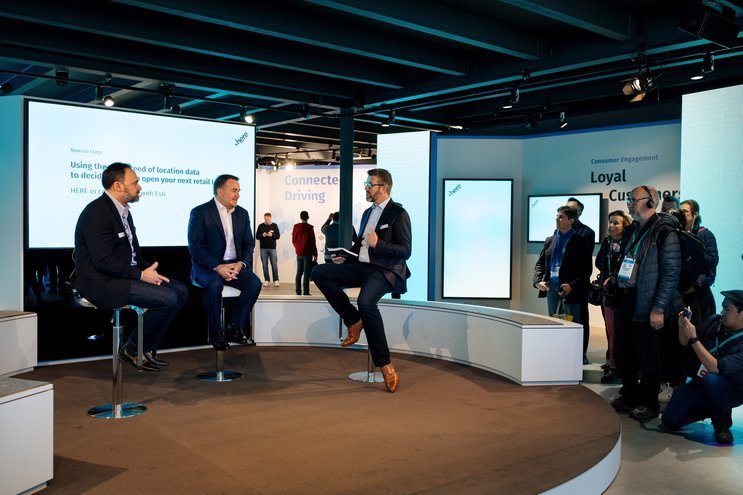
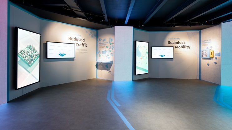
Seven nieches are arranged in a circle around the stage, just like stalls on a market square. Every nieche represents one topic HERE offers solutions for. Orientation is made simple by the use of large typography and a clear, consistent layout.
Multi-Level Learning
Technology Stories
In close collaboration with the client, we structured HERE’s extensive product portfolio by formulating use cases which unite related solutions under one clear topic. Each use case is addressed at a corresponding niche via analog and digital media.
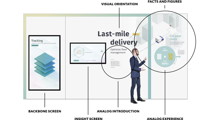
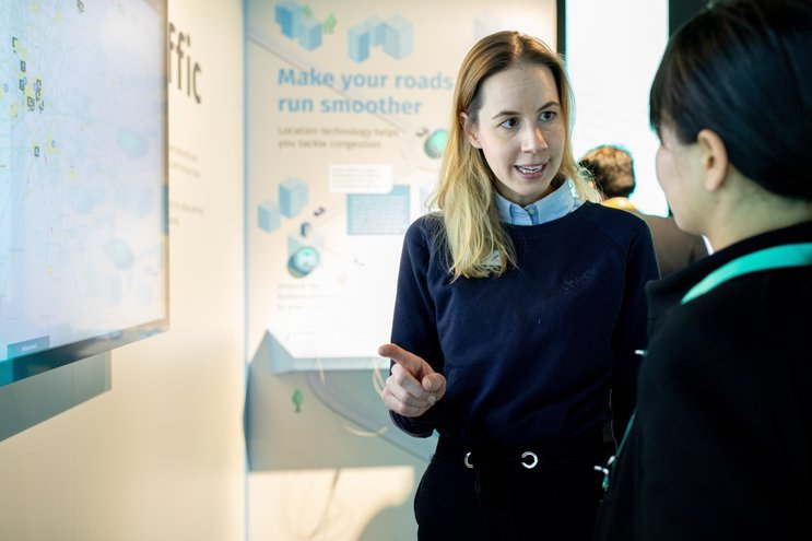
The niches are made up of several fine-tuned components which together form a multi-layered environment for interaction and learning. Visitors are automatically guided through different levels of complexity when exploring the use case while brand ambassadors are provided with a toolkit for dynamic and meaningful presentations.
Analog Experiences
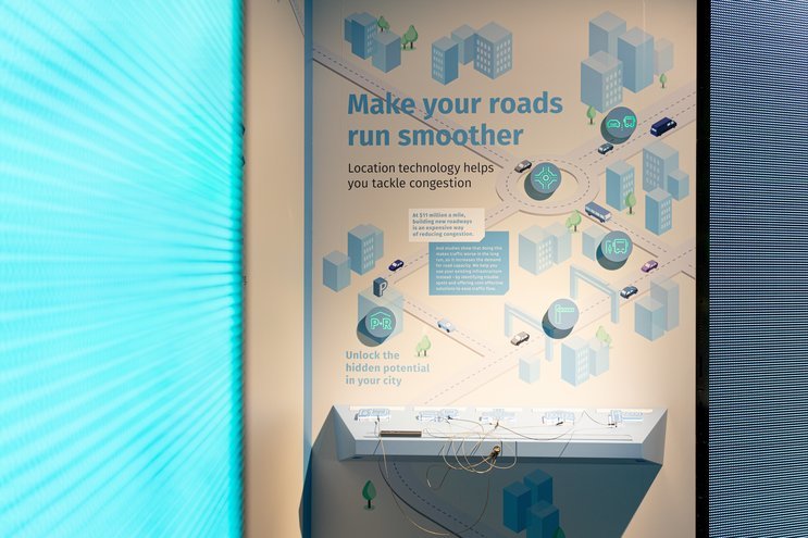
Typography and infographics create attraction, give orientation and a first, purely visual overview of the topic addressed.
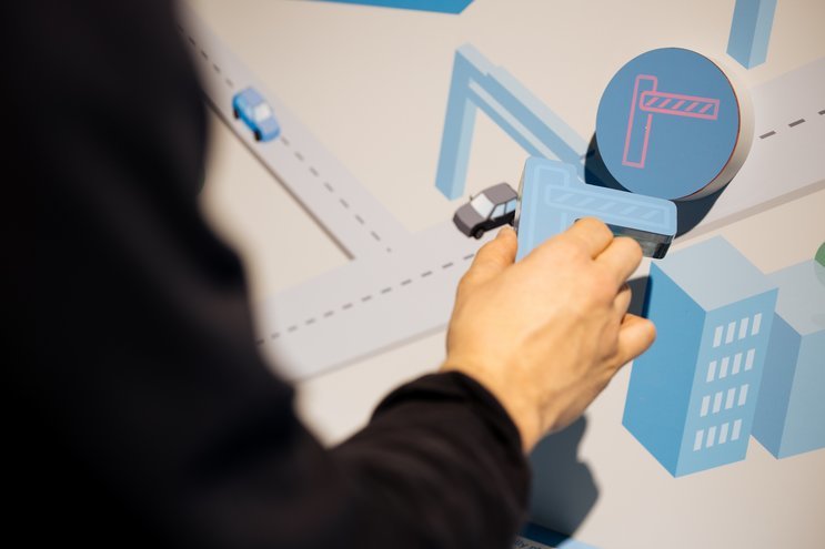
Playful exhibits translate the solution into simple, hands-on experiments. Without even noticing, visitors explore complex technologies on an abstract level.
The Backbone Screen
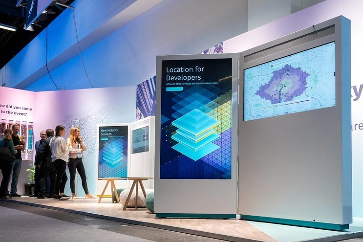
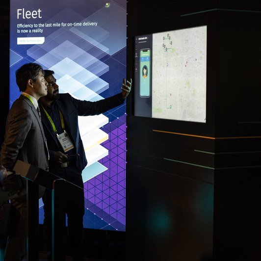
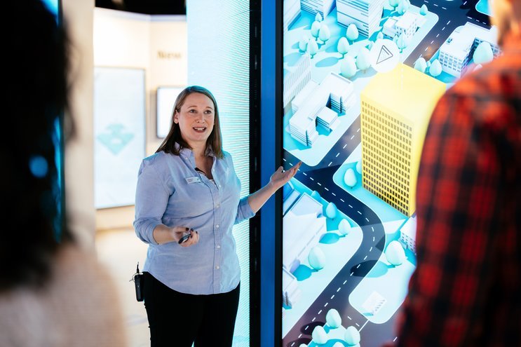
The large Backbone Screen serves as the visual gateway to the use case.
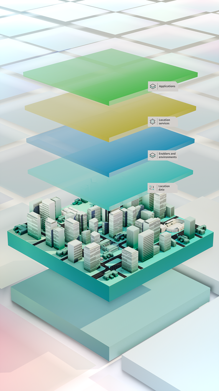
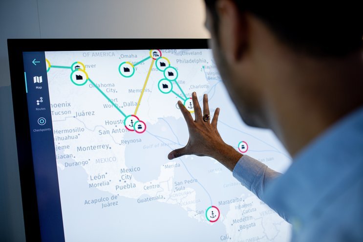
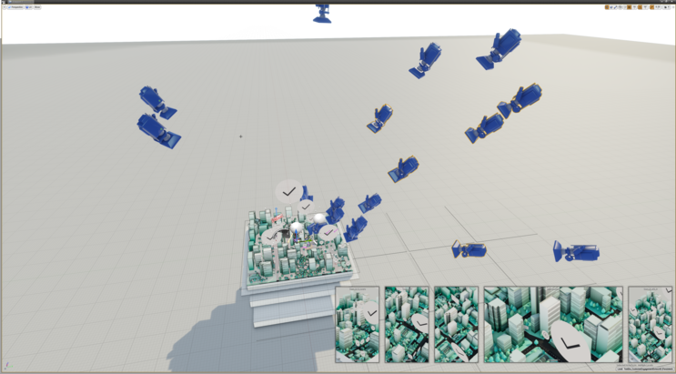
Evolved from last year’s systematic, topics are placed on the Reality Grid, with stacked layers representing different levels of information. Brand ambassadors use this virtual environment to navigate and tailor their presentation to each individual visitor and their interests.
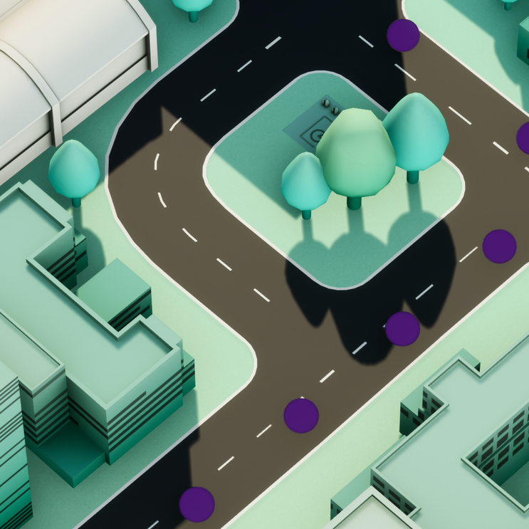
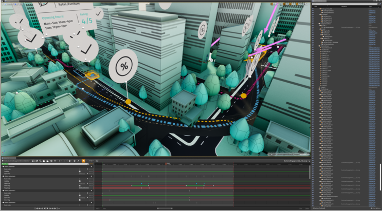
The so-called Dot World provides a fun and low-barrier introduction to the use cases. Visitors dive into a colourful, interactive environment in which real-world challenges and the solutions offered by HERE are explained in short narratives. Facts, figures and further information are seamlessly integrated into the storyline. In the process, our friends from Bizzlogic supported us with their development and design expertise in creating the framework for these digital story-telling tools.

The Insight Screen
The smaller Insight Screen can be used to display various media content. The flexible design framework is suited for any format, from corporate presentations to film sequences to specially created material and interactive experiences. Just like a passepartout, it delivers a consistent look and feel without prior adjustments.
Even though each Use Case is prominently represented by one niche, all content can be accessed from any device in the pavilion’s media infrastructure. This gives brand ambassadors the freedom to react to the course of conversation or flow of visitors without changing location.
A global media platform
Managing Experiences
Far beyond their pavilion at CES, HERE runs a worldwide network of touchpoints for clients and partners, from offices to showrooms to trade fair booths and events. Permanent installations are equipped with the Reality Cores. For temporary use, we designed the Mobile Cores and Mobile Satellites, an easy to set up plug-and-play version suited for airfreight shipment.
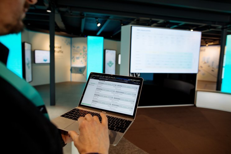
To be able to maintain, update and monitor this vast media infrastructure, we developed a powerful software solution, the Experience Management System (EMS).
The EMS is a dynamic platform on which all content designed for external communication is stored. In the case of HERE, this includes the interactive dotworld scenarios just as corporate presentations, fact sheets or commercial videos.
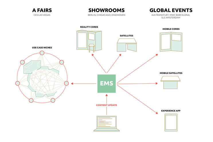
Modifications to the content can be made from any place and any device conntected to the EMS. Within just a few seconds of rebooting, the update is pushed to all elements of the infrastructure, allowing for a worldwide content management in real-time.
What this means in practice is maximum flexibility and efficiency. The media network can now be curated by a decentralized team and monitored at one glance. Changes can be made last minute, both on site and remotely, and reviewed immediately. Especially for large-scale events with tight time schedules, the EMS opens up entirely new potential in project management.
HERE implemented the latest version of the EMS in the course of CES 2020 and now runs all its touchpoints on this custom software basis.
Making-Of
Before the Show
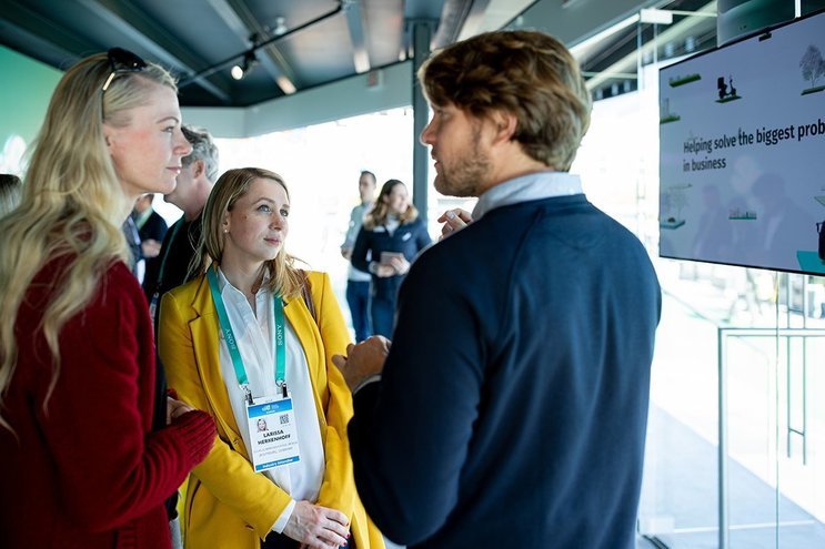
For this large-scale project, we brought together a multidisciplinary team and worked with great partners. The responsibility from start to finish and the trusting relationship with HERE gave us the creative freedom to make a leap forward in terms of technology and design.
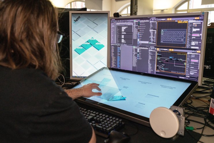
Over the past year, we implemented Unreal Engine as our main development tool for real-time graphics. The transition helped us unlock new potential in interaction and take visual quality to the next level. For this particulat project, our team pushed the boundaries of the software far beyond its usual application. Custom-built blueprints and programming were key to a dynamic, efficient workflow crucial for handling the amount of content we were faced with.
All installations were put to the test by our experts to guarantee flawless functioning.
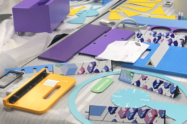
From choosing the hardware suppliers to managing the set-up on site, we made sure all project stages ran smoothly.
Related Projects
Curious about our approach? Feel free to get in touch!
Sebastian Oschatz Partner +49 69 24 000 321 sebastian.oschatz@meso.design sebastian.oschatz@meso.design +49 69 24 000 321
MESO Digital Interiors GmbH
Gutleutstr. 96 . 60329 Frankfurt . Germany
Team
Alec Woodward Mitchel, Alessia Corsini, Alex Leask, Alexander Teczar, Alex Völkle, Andreas Behl, Anna Rack, Anton Viehl, Björn Simonsen, Christian Tietz, Constantin Urban, Daniel Henning, Daniel Maaz, David Morasz, Fabian Litwin, Fatih Inan, Floriane Zhang, Frank Brammer, Hannes Raff, Henry Hilge, Ian Rodriguez, Ina Bosch, Joakim Repomaa, Johanno Heß, Jonas Schreiber, Jörg Kahlhöfer, Kim Angie Cicuttin, Laura Schillke, Marcus Michaely, Marvin Shah, Mathias Wollin, Max Wolf, Michel Rubner, Pascal Kümper, Paula Müller, Ramón Janousch, Roland Eisert, Rongyuan Xu, Sebastian Kujas, Sebastian Oschatz, Sebastian Quader, Timon Skerutsch
