HERE Technologies is one of the leading players in the field of digital mapping and location data. Premiering for CES 2019 in Las Vegas, we developed a consistent narrative applicable to all elements of the brand appearance. The systemic concept took the entire visitor experience into account including strategy, scenography, content development, interaction design, visualization, and technical implementation. Furthermore, it is designed to roll out for a variety of events and experience centers beyond CES.
Systemic approach
technology brought to life
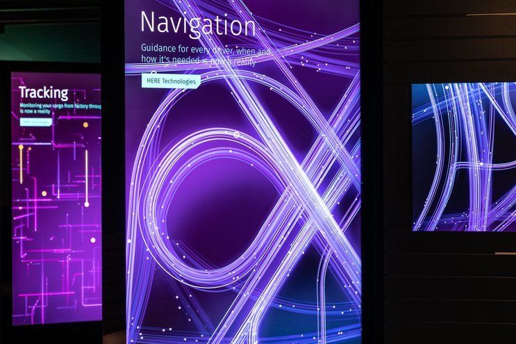
HERE Technologies works on building the “Reality Index™”, a digital representation of the world – three-dimensional, real-time, and as detailed as possible. This goal is pursued by 8,000 employees in 200 offices across 55 countries. A wide range of digital products and services in multiple fields, from automated driving to fleet tracking to consumer analysis, is derived from this extensive data base.
To stay in contact with their partners and clients, HERE is present at events and trade fairs all year round and is implementing experience centers across the globe. For these brand spaces, we were commissioned to develop a recognizable and consistent overall design including coherent narratives, media strategy and visualization as well as a distinctive scenography enabling impressive product presentations. Rather than looking at each use case in isolation, we went for a systemic approach and created a modular and scalable principle applicable to a wide range of spatial conditions and focus topics.
To achieve maximum usability and authenticity, we worked in close collaboration and constant exchange with HERE’s brand and design departments as well as with the actual product owners and developers. In this way, we were able to establish a multi-channel and multi-level communication concept.
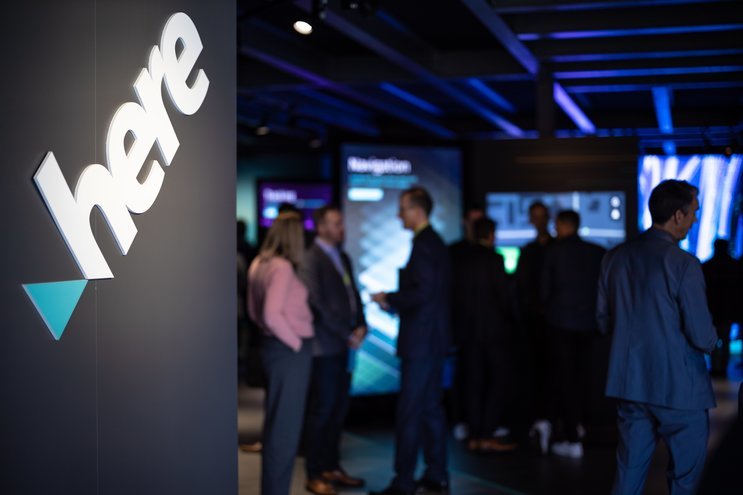
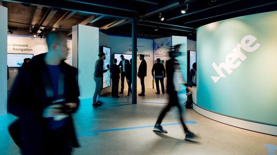
The concept premiered at CES 2019 in Las Vegas, the world’s largest consumer electronics fair. Jack Morton designed an architectural concept for HERE taking shape in an impressive pavilion. For this space we created a bold and coherent storytelling environment on the ground floor fitted with bespoke media stations, powerful presentation tools, and a versatile software background.
I think it’s just one word – it’s unbelievable. […] Wether it’s the content and the consistency that I see downstairs and projected on the screens or the design. […] Thank you very much.
Communication Concept
real expertise speaking for itself
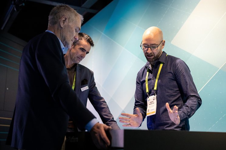
Nobody knows the company, its products and services better than the people who developed them. So why let anyone but them tell HERE’s story?
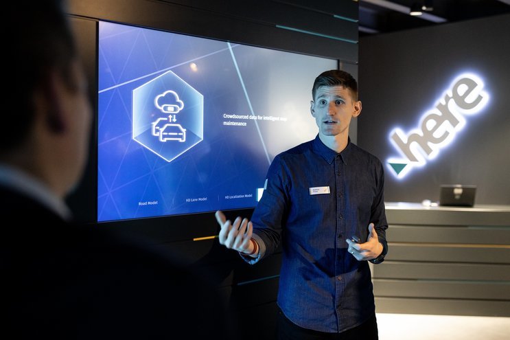
The communication concept was based around these brand ambassadors – engineers, developers, and sales people from various departments. They formed the heart of the experience, giving the company a face and a personal touchpoint. Visitors had the chance to receive first-hand explanations, knowledgeable insights and precise answers to their questions.
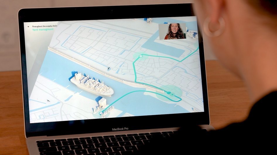
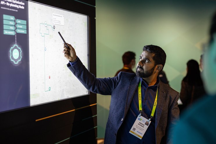
Powerful presentation tools and a versatile software environment enabled impressive and authentic messaging. Together with HERE’s Content Studio, we developed a framework that allowed the presenters to address mainly B2B audiences such as analysts and business specialists with the content necessary to deliver convincing brand messages and use case specific details. A range of media platforms and narrative threads allowed to adapt to the requirements of every situation in visitor interaction.
The Physical Framework
A Stage for Data
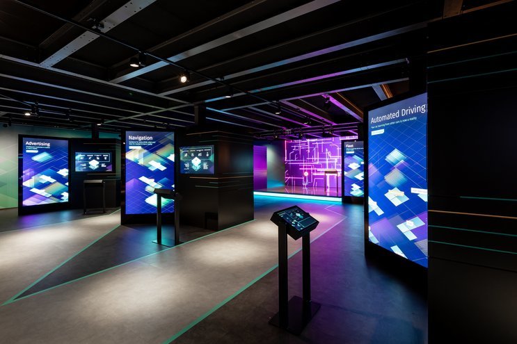
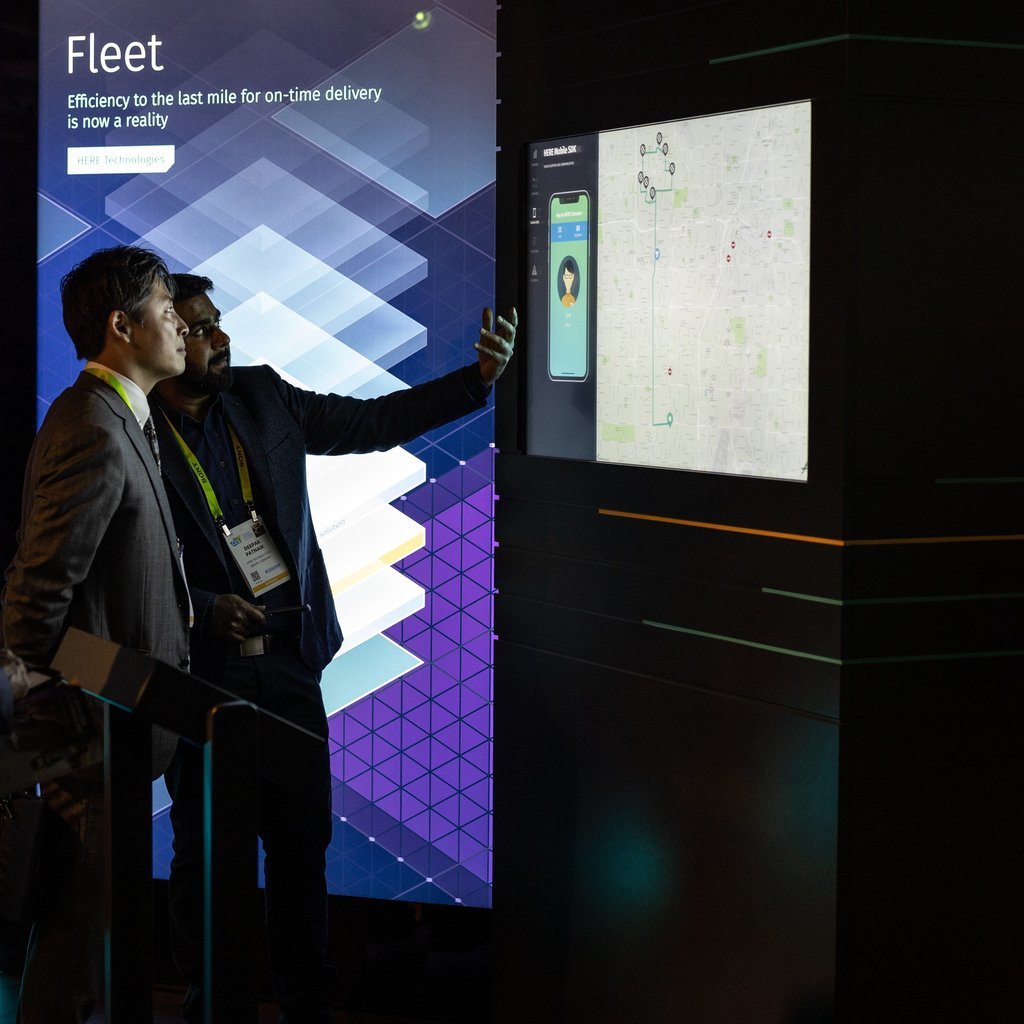
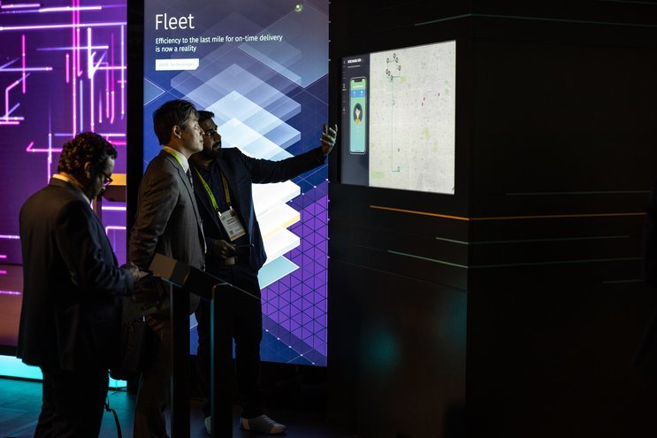
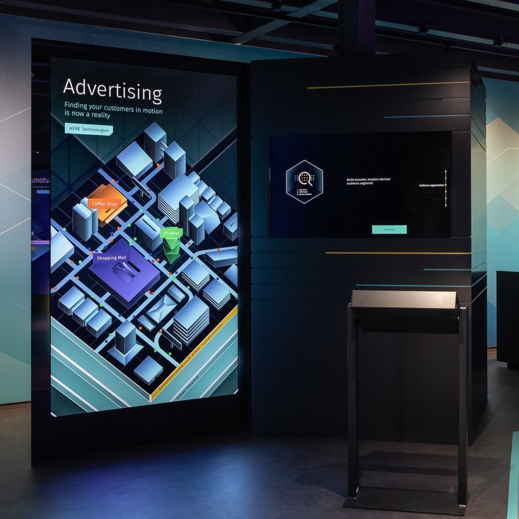
HERE identified six highly diverse business use cases ranging from advertising technology to fleet management to navigation as a service. They make up the six thematic areas of the exhibition space. To achieve a unified appearance despite the diverse content, we developed a bespoke system of media stations.
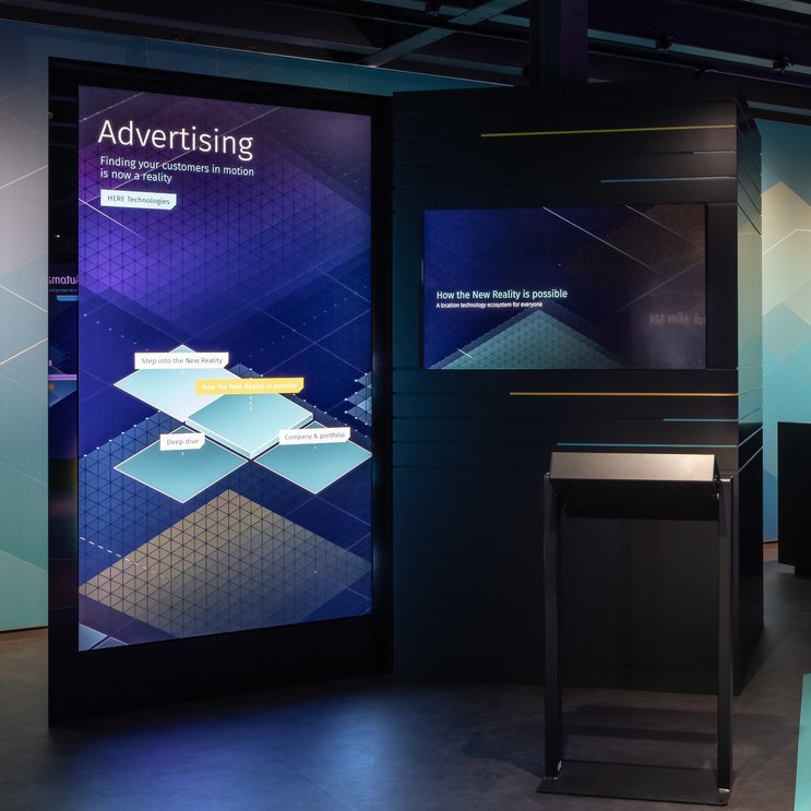
Each area is fitted with an identical architectural element, the Reality Core. Made up of two large-scale extruded triangles formally derived from HERE’s logo, they structure the space and act as the main presentation tool.
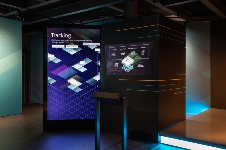
The Reality Cores integrate two screens, the large-scale vertical Backbone Screenand the 16:9 format landscape Insight Screen. When activated, the two screens interplay and form a single presentation tool: while the Backbone Screen acts mainly as a navigation and orientation medium, the Insight Screen displays footage visually supporting the brand ambassador’s product pitch.
The set-up is complemented by the Tiltable screen, which can be used as a control device and confidence screen with speaker notes.
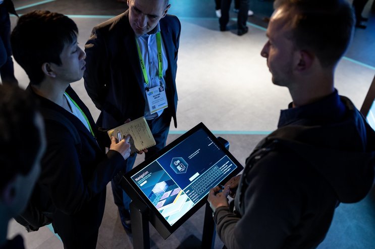
Three media tables, the Satellites, are used for dynamic group discussions and come with additional interaction features.
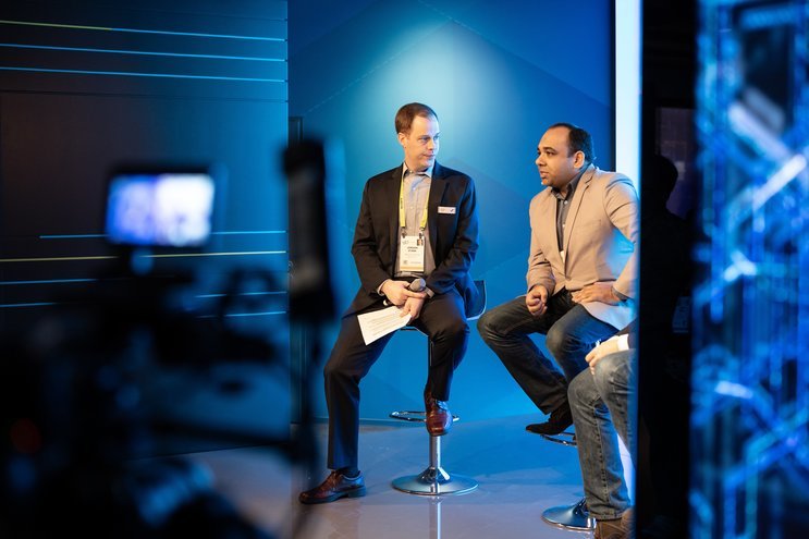
The Highlight Stage plays a focal part in broadcasting HERE’s objectives of creating new business opportunities through location intelligence as well as their desire to build strong partnerships. This was achieved through a schedule of four themed talks per day. In order to ensure that the Highlight Stage became the center of attention during these 15-minute intervals, the Reality Cores were automatically put into an idle mode, shifting the booth focus from use case to brand. All presentations from the Reality Cores were also accessible on the Highlight stage.
The large-scale exterior LED served as a medial extension of the expressive booth architecture designed by Jack Morton. Blurring the boundaries between static structure and digital display, in cooperation with Flora and Fauna we developed a 12-minute loop. These visuals sent strong brand messages and highlighted the six use cases presented in the booth’s interior. Furthermore, the visuals were also displayed on the LED of the Highlight Stage.
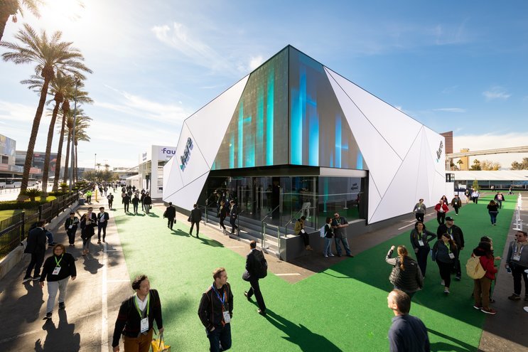
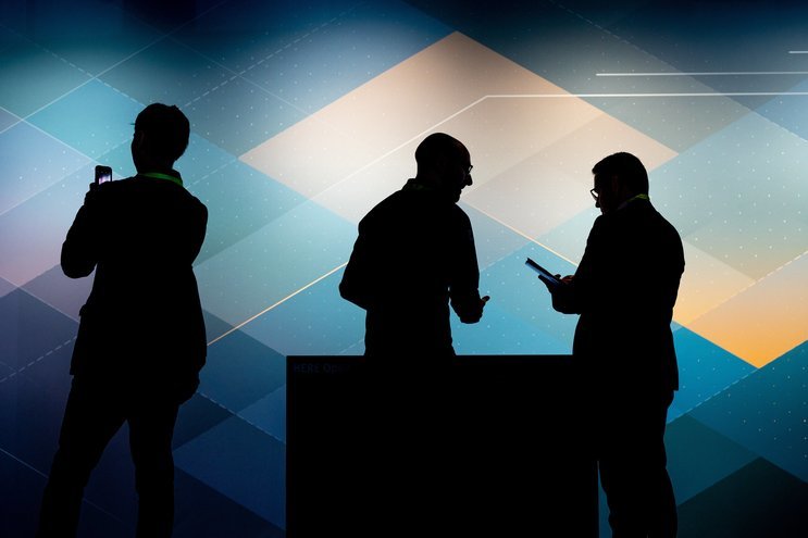
The entrance area seamlessly connected the exterior and interior of the booth in a coherent visual language.
A systemic passepartout
Welcome to the Reality Grid
The extensive product range created by the different departments at HERE is represented by a diverse pool of presentation content, including films, animations, visualizations, and text slides. Together with HERE’s content studio, we developed a structural and visual framework compatible with all these formats while embedding them into a unified overall design. This approach means all existing media can be integrated and new presentation content may be fed in any time.
To enable powerful presentations addressing to the individual visitor’s needs, we created consistent narrative structures supported by custom visuals.
The brand ambassadors took visitors on a journey through a virtual environment, the Reality Grid, where information and media is distributed three-dimensionally as stacks of layers. In this way, personal interaction and predesigned contents form a single impression.
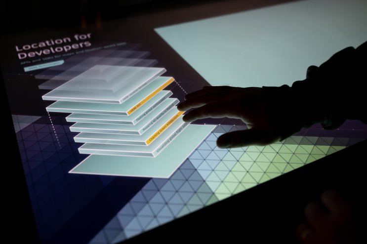
Presenters could choose the level of complexity according to the needs and pre-knowledge of their audience. From bespoke animations allowing high-level introductions to product-oriented deep dives aimed at experts, a broad scope of narrative approaches was possible.
Thanks to the flexible data structure, all content could be accessed from any presentation platform. Depending on demand, brand ambassadors could switch to general information on the company or jump to a different thematic area without changing location.
International Roll-out
A system for all spaces
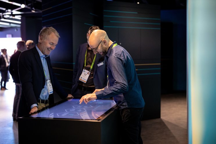
CES 2019 was a great success with brand ambassadors, visitors, and HERE’s management being equally convinced by the approach.
The concept will now be extended to experience centers from Chicago to Singapore to Berlin and Frankfurt and serve as the basis for all upcoming trade fair appearances. Backed up by the specially designed content hub Experience Management System (EMS), all communicative measures can be rolled out globally, scaled up or down in size, as well as be launched to various digital derivates.
The next steps include creating versions of the Reality Cores with reduced size for easier transportation and quicker set-up at smaller events, as well as mobile versions for sales staff.
Related Projects
Curious about our approach? Feel free to get in touch!
Sebastian Oschatz Partner +49 69 24 000 321 sebastian.oschatz@meso.design sebastian.oschatz@meso.design +49 69 24 000 321
MESO Digital Interiors GmbH
Gutleutstr. 96 . 60329 Frankfurt . Germany
Team
Alec Woodward Mitchel, Anna Rack, Alessia Corsini, Alex Leask, Daniel Maaz, Nina Dauer, Fabio Thiel, Johannes Lemke, Joakim Repomaa, Johannes Scherg, David Brüll, Daniel Henning, Woeishi Lean, Sebastian Oschatz, Johanno Heß, Henry Hilge, Kim Angie Cicuttin, Majo Balko, Frank Brammer, Hannes Raff, Ian Rodriguez, Patrick Seuffert, David Morasz, Michel Rubner, Andreas Behl, Marcus Michaely, K. Ulrich Schneider
