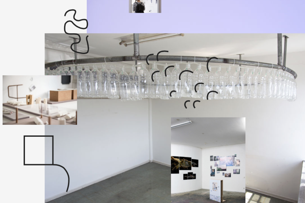
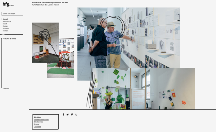
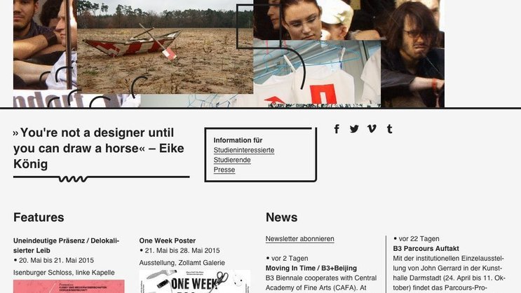
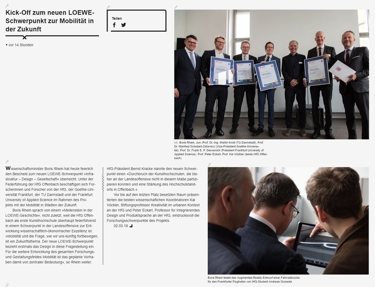
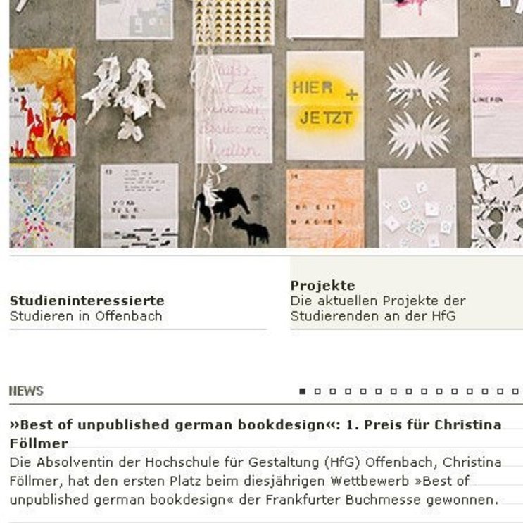
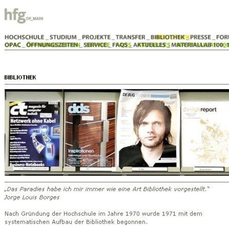
We have developed the website Hochschule für Gestaltung Offenbach (University of Art and Design Offenbach) since early 2000. In its fourth incarnation from 2015, the visual design and concept of the website was created by a student team around Matthias Bär and Prof. Alexander Oppermann and they did a great job hitting the thin line between chaos and usability that best represents what the HfG is all about.
Agile process
Design meets technical solutions
In a very agile process, we threw in all of our knowledge about how to bring a concept like this to life.
Together with the team, we tried to realize the project as close as possible to the students’ design proposal.
User experience
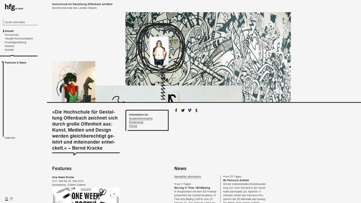
Advanced readability and graphical attraction
With some hard work, nearly all of the proposed features were made possible.
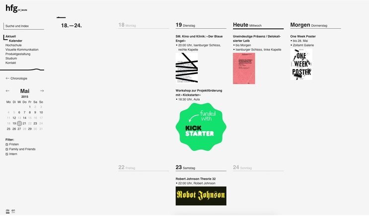
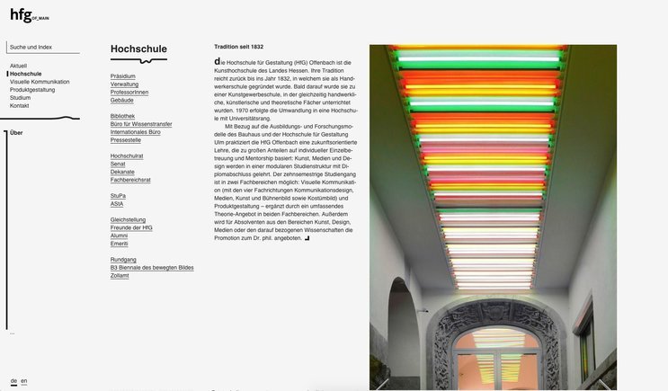
Random-like graphic elements, a multi-column JavaScript layout with responsive rules for text re-flow and live hyphenation, and readable rendering on even most older browsers.
Managed content
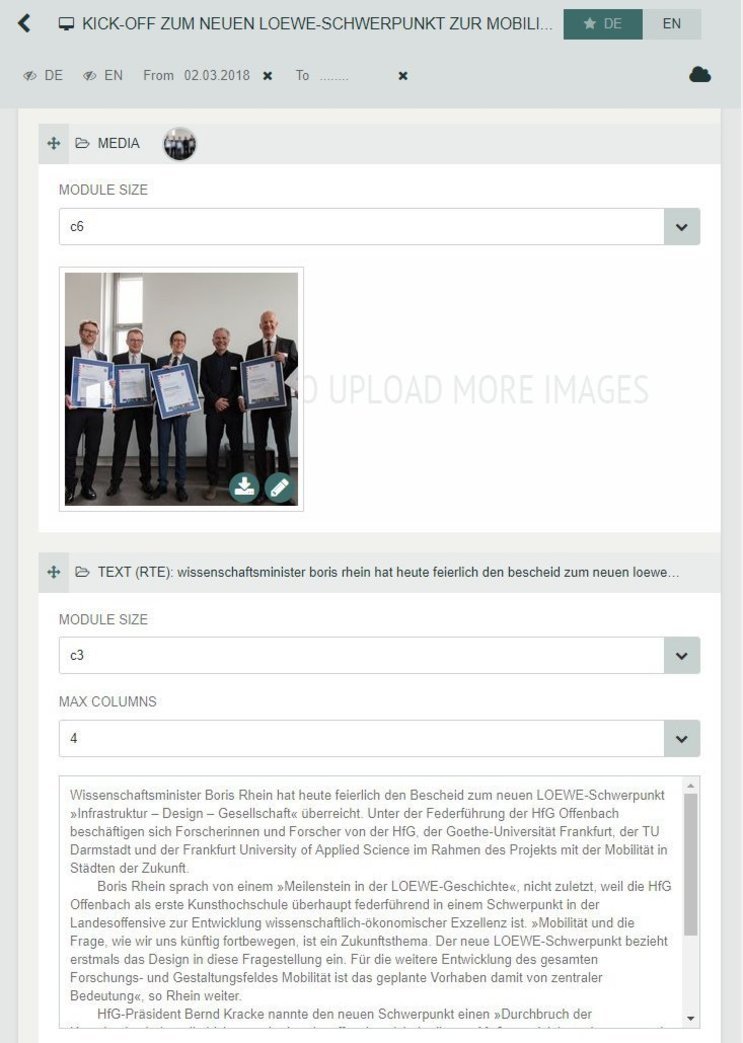
Creating a bespoke editing system
The HfG Offenbach is extremely open in encouraging professors to develop innovative formats. Over the years the our website has become the major tool to communicate the manifold projects and formats within the school. Some consider it even as an unofficial ranking platform for the faculty.
Editorial editing made easy for all members of the HfG.
Previous version of 2000
Already introduing a CMS
Being part of their diploma when they were students at HfG themselves, Martin Schuster and Mathias Wollin created the first website version based on a database driven web system.
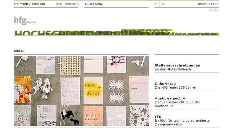
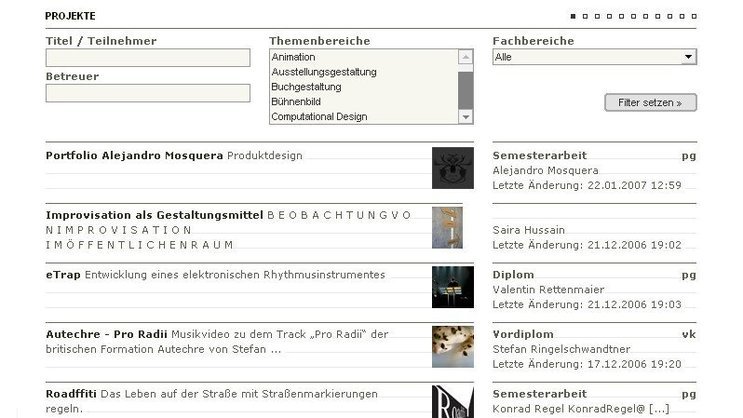
The multi purpose web was already based on a content management system, marking an important step as it was quite a novelty back then. This allowed students to publish their work in a quick and easy way, without the hassles of registering and programming their own website.
The former "fleeing" menu made room for the new flash menu which with its fehlfarben behavior is an homage to the print techniques also still taught there, and tries to give the website a typographical touch by letting the letters "hit" the screen from behind when idle.
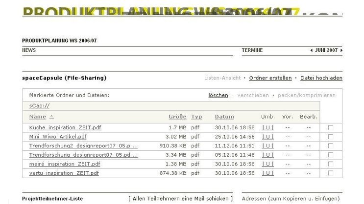
Another newly introduced tool is called "workgroups". Used for collaborating when meetings are few or when some project participants are abroad, this tool lets the project groups share files, knowledge and timetables in a simple to use online file system.

Curious about our approach? Feel free to get in touch!
Mathias Wollin Partner +49 69 24 000 326 mathias.wollin@meso.design mathias.wollin@meso.design +49 69 24 000 326
MESO Digital Interiors GmbH
Gutleutstr. 96 . 60329 Frankfurt . Germany
Team
Martin Schuster, Joakim Repomaa, Alessia Corsini
