Opening people’s eyes to the world of those who can’t see – that is the declared goal of Frankfurt’s Dialogmuseum. For its new location, we designed, programmed and constructed two interactive installations for visitor interaction.
A museum for the senses
Digital Dialog
In September 2021, after months of renovation, the Dialogmuseum opened its new premises at Hauptwache underground station in central Frankfurt. With a permanent exhibition set in total darkness, visitors are invited to dive into the world of perception of blind or visually impaired people. A parcours with objects, participation stations and a bar can be explored via hearing, touch, taste or smell. The aim is to create awareness and sensibility within a broad target group.
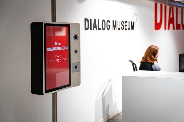
The foyer – the only illuminated part of the museum – serves as a welcome, orientation and communication area. To enable exchange between visitors and the museum, we were commissioned to develop a terminal offering information, contacts, a donation fuction and a digital selfie-collection. A second custom station, a digital Guestbook, marks the end of the exhibition and gives visitors the opportunity to comment on their experience.
Special about this project was the strong emphasis on accessibility in line with the museum’s philosophy – from high-contrast graphic design to the integration of Braille type to audio-based in- and output options and clever constructions.
As an inclusive enterprise, the Dialogmuseum wants to set an example in the field of digital accessibility. At MESO, we were met with great openness towards entering new territory. To us, it turned out to be an extremely fortunate cooperation.
Get involved
Turning visitors into partners
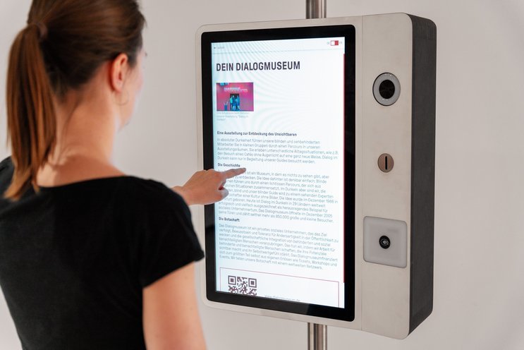
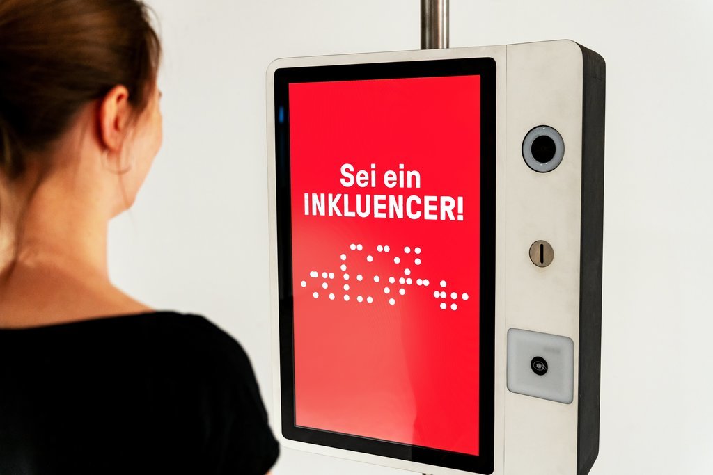
The Sharing Station is a touchpoint that unites different possibilities to interact. The custom media set-up comes with a touchscreen and three integrated special modules:
- A high definition webcam with a ring light
- A slot for inserting donations as coins
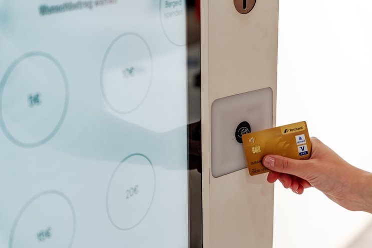
- A reader for donations by contactless card payment
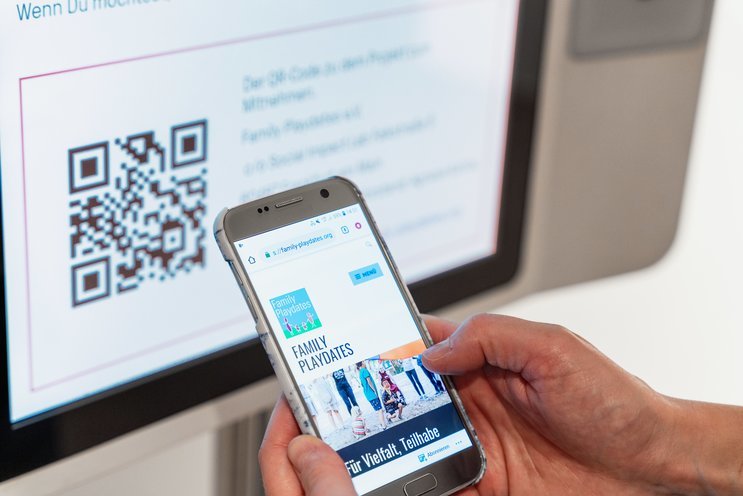
Articles on the museum and its international network partners can be edited by the staff independently using a bespoke content management system. To allow partners to link to their own content while meeting high security standards, external links are only accessed via the visitors’ smartphones with QR-codes.
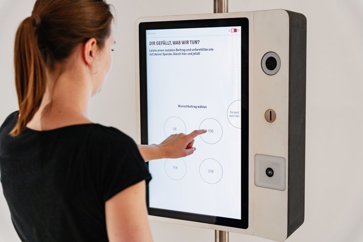
The donation function offers two low-barrier options for supporting the museum. Visitors can either contribute in an entirely analog way by inserting coins directly into a slot or they can transfer money by card payment. For this service, we integrated a card reader and custom interface with the banking provider. After choosing between four amounts, contactless and secure payment is enabled.
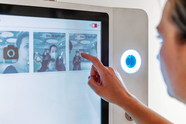
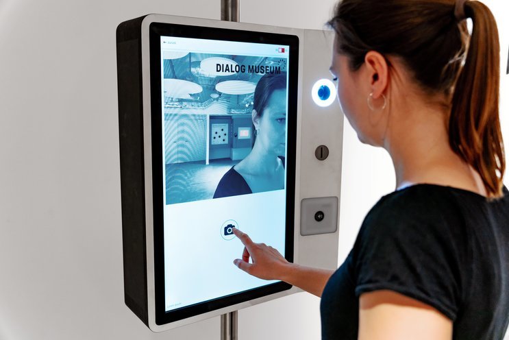
An additional function of the Sharing Station gives visitors the opportunity to become part of a digital picture gallery. An integrated selfie camera is activated upon touch and takes a picture after a countdown. The image can then either be deleted, posted to the gallery or sent to the personal email address.
Visitors are encouraged to not only portray themselves but also to document the (social) commitments they were inspired to make after visiting the exhibition. Physical signs are ready to be used as props for the photo.
Feedback Function for everyone
An audible and visible guestbook
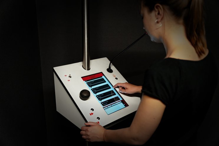
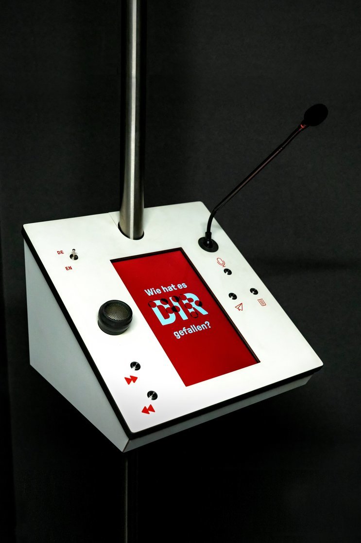
One focus of the Dialogmuseum team was to enabling all visitors to share their thoughts, give feedback and learn about how other people experienced the exhibition. This touchpoint needed to be accessible for everyone, for people with visual impairments as well as for very young visitors. We designed a digital Guestbook station that provides different interaction possibilities for reading, navigating and commenting.
Together with MESO, we managed to create the first-ever Guestbook that can be equally used by sighted visitors as well as our blind or visually impaired staff. A major step towards inclusion in museums!
Past entries are presented in a chronological feed. They can either be explored by scrolling via the touch display or by skipping through the feed using mechanical buttons.
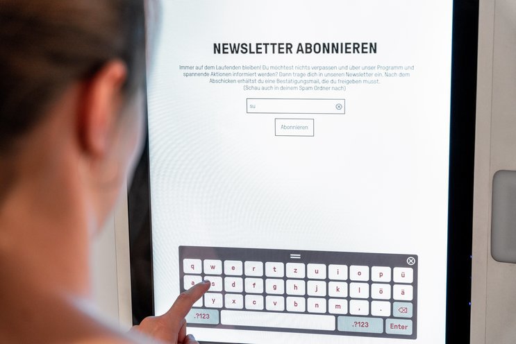
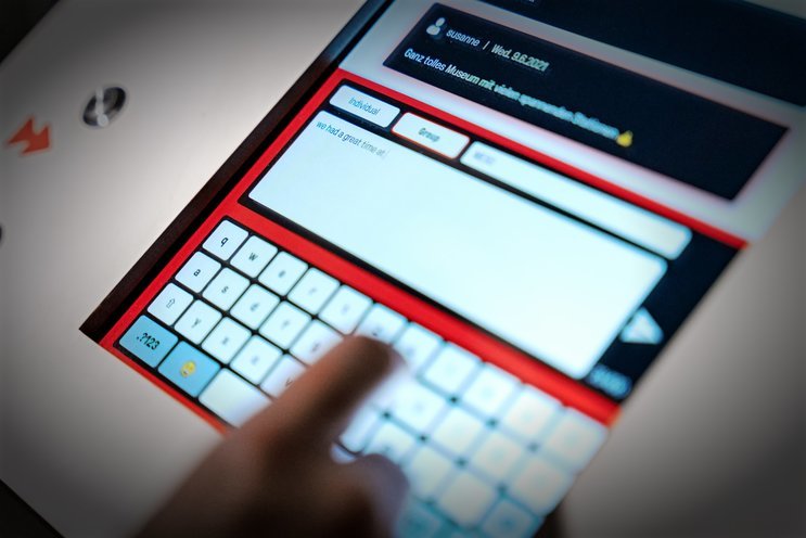
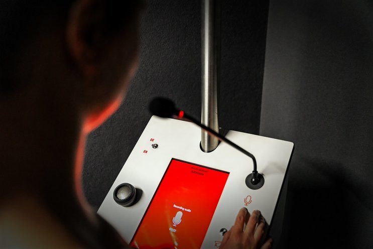
Visitors have two options for leaving a comment: they can type a text with an on-screen keyboard or record an audio entry using the gooseneck microphone integrated into the terminal.
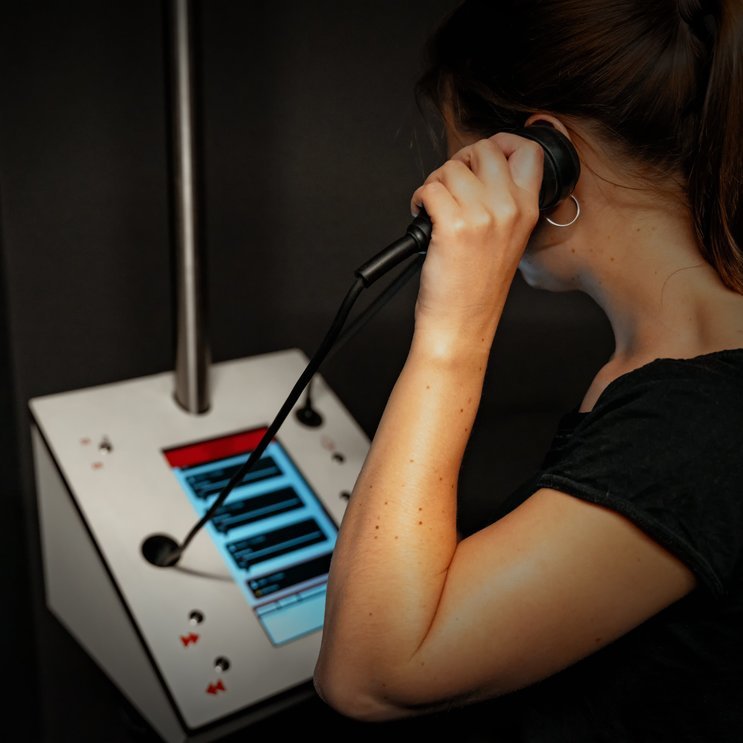
A complementary audio-mode makes text entries accessible beyond reading on the screen. It is activated as soon as the connected one hand earphone is picked up and turns text into speech using a screen reader.
To inhibit unappropriate comments and enable curation of entries, the Guestbook station is connected to the reception desk. The museum staff can review entries and publish or archive them. As in the Guestbook, an integrated screen reader makes the administration view accessible for staff with visual impairments.
Design for inclusion
Simple tweaks and clever solutions
In close collaboration with the Dialogmuseum team, we made sure to make the media stations accessible to as many people as possible.
Screendesin-wise, we opted for a simple user interface, high-contrast layouts and large typography. Also the hardware was tested, reviewed and refined to meet the standards required for people with impaired vision.
The terminals’ size as well as the position of all buttons and interaction elements are optimized to be explored by touch. Buttons are raised and give a mechanical feedback when pushed.
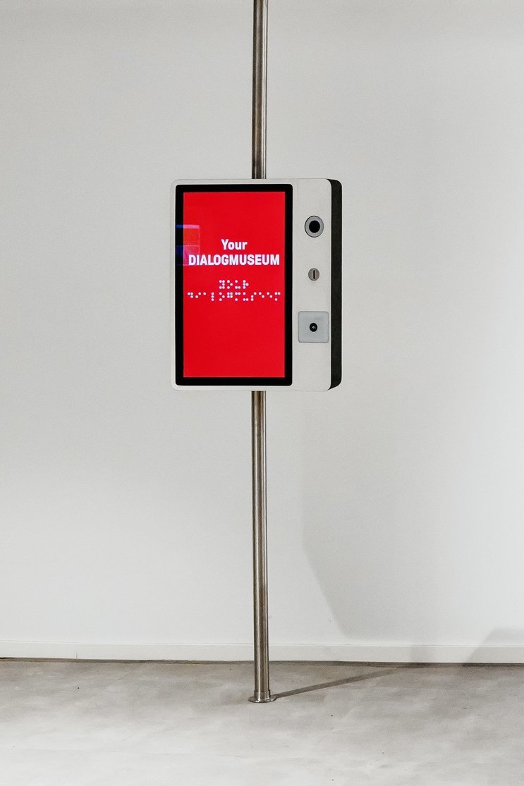
To save space and guarantee accessibility for wheelchair users, the terminals are mounted to a ceiling-high pole. All electronic elements – the small high-performance computers, cables and connectors – are either integrated into the terminals casing or run through the hollow pole into the suspended ceiling.
To visually connect the museum’s visitor touchpoints, attract attention and teaser contents, we created a consistent idlemode logic in line with the existing CI. Messages in conventional black print are merged with translations into Braille in different animations to create a bold statement.
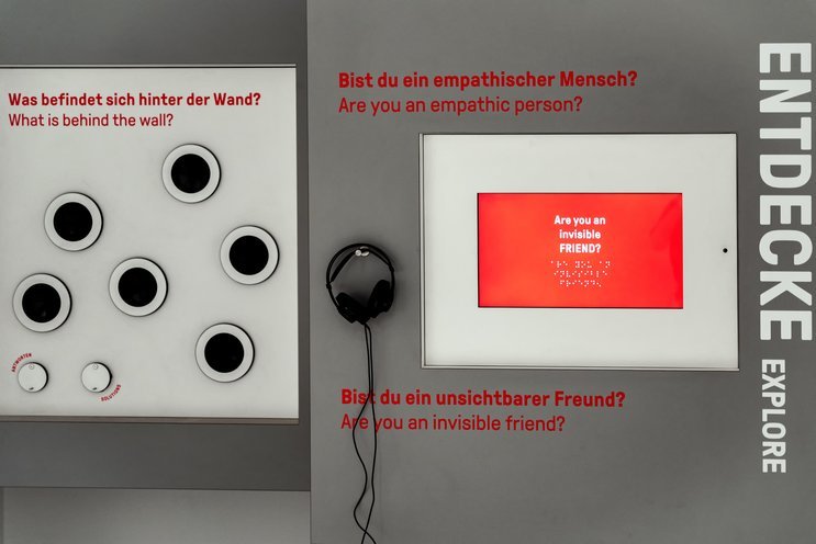
As part of the general media planning, we also integrated two existing games into the welcome area parcours. With state-of-the-art media technology in line with the new Guestbook and Sharing Station as well as the extension of the idle mode logic, a harmonious look and flawless visitor experience could be guaranteed.
Related Projects

Curious about our approach? Feel free to get in touch!
Max Wolf Partner +49 69 24 000 322 max.wolf@meso.design max.wolf@meso.design +49 69 24 000 322
MESO Digital Interiors GmbH
Gutleutstr. 96 . 60329 Frankfurt . Germany
Team
Susanne Heinlein, Sebastian Kujas, Marcus Schreiter, Timon Skerutsch, Constantin Urban
